
Putting the Rutkowski Law Firm on the map
Based out of Rochester, Michigan, the newly-formed Rutkowski Law Firm is a full service firm dedicated to superior legal services. When it came time to develop their brand, they weren’t looking for the typical visual presentation found in most other firms. RLF enlisted Gumro Media to pioneer a fresh and modern look to represent them.
Developing a new brand from scratch is exactly the kind of challenge we love to sink our teeth into. So with a creative direction in mind, we were ready to bring the Rutkowski Law Firm to life.
OUR MAIN GOALS
Unique
Appeal
Unique
Appeal
A professional look with a fresh and modern flair to set RLF apart from the hordes of other glib and banal law firms out there.
Quick
Information
Quick
Information
The user should never be lost in complex site architecture. Everything should be quick and easy to find.
Screen
Space
Screen
Space
Fit as much information into as little space as possible. Use of bootstrap modals helped supplement space.
Easy
Contact
Easy
Contact
Contacting the firm is the main objective, so the phone number is easily found and always visible.
Project Overview
Branding RLF consisted of two interconnected projects:
Visual Identity
Starting with the logo, we developed a set of stationary designs and typeface, then created guidelines to futureproof them for any new print materials they may want down the road.
Website
The website mimicks a physical desktop with interactive elements on the left side. The main challenge was screen real-estate, which we remedied with the ever-convenient Bootstrap modal feature.
The objective was to create a clean and organized look that is never confusing or overwhelming. Clear communication is a way of life at RLF, and we translated that ideology to the design.
“The Rutkowski Law Firm team dedicates itself to listening to clients' needs and providing clear, prompt, and reliable communication in return.” Michael L. Rutkowski, Attorney at Rutkowski Law Firm
Make me unique
Let me paint you a picture: You are seated in a bare-walled law office surrounded by the heads and bodies of attorneys. This is a cold room, wood-walled, hard-floored. Grim faces are buffered across a polished conference table. They page through your files as you sit cross-legged in silence.
Not exactly our idea of fun. And as it turns out, that's not how the Rutkowski Law Firm wants to do things either. So when they approached Gumro Media for the essential step of brand discovery, they made a unique request. They wanted something professional, but with a fresh and modern flair to set them apart from the hordes of other glib and banal law firms out there.
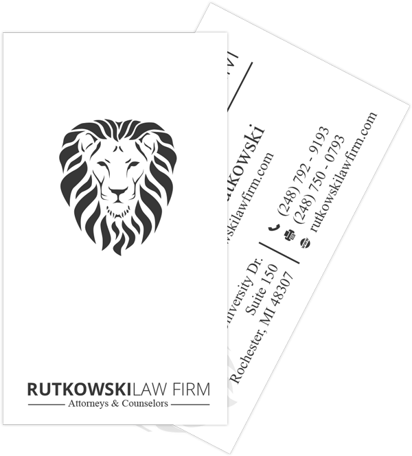
Logo
The Lion's Share
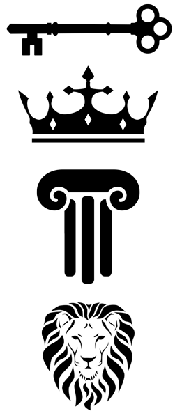
Like all of our projects, we began with the discovery process. After an informative sit-down with the firm, we internalized their brand and business goals. Every design choice we made would be driven by these goals. With that in mind, we began with the logo. The logo would lend to every subsequent design choice from a simple letterhead to the final website. We presented a vast number of logos and let the client narrow it down to four. After iterating over several variations of these four logos, a clear favorite emerged: the king of the jungle.
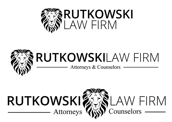
Bold, black logos that look good in print and pair well with any design scheme.
The king has arrived
After much deliberation and a lot of back and forth, it was decided that the lion would represent the Rutkowski Law Firm. We paired it with a modern sans serif font and arranged it for three different print sizes.
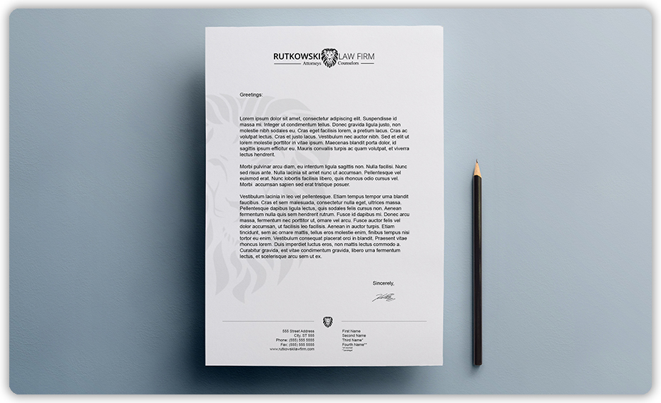
Stationary
Paper trail
A complete brand development took place around that logo and extended beyond digital channels. To translate their reputation across tangible materials, Gumro Media developed a strategic game plan ensuring that every touchpoint conveyed the new brand aesthetic and tone, no matter the medium.
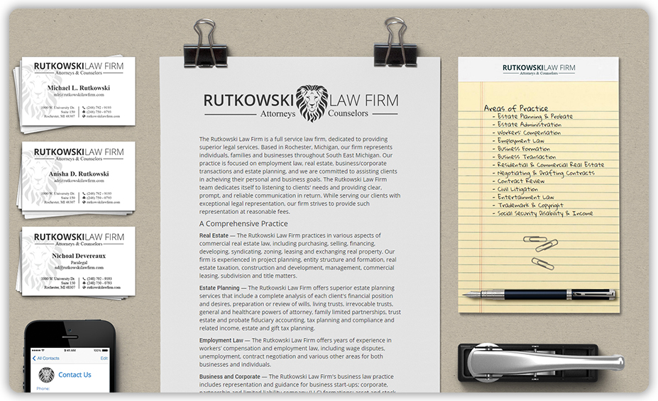
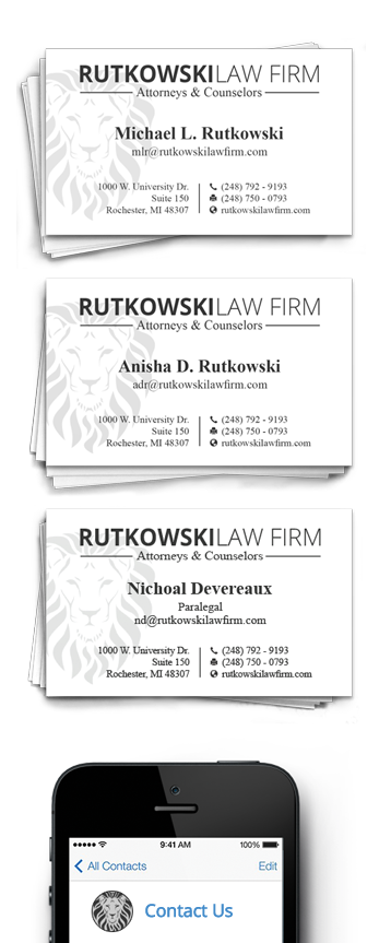
Business Cards
We partnered with local printer Allegra to press the cards on high quality stock. They added a UV spot gloss on the lion to make it pop.
Card Design
We presented RLF with an exhaustive array of business card designs to look through. We tried vertical layouts, patterned backgrounds, unconventional shapes, etc... In the end, the idea that won over was a simple double-sided layout. The front contains the information paired with a watermark. The back prominently features the logo with a gloss effect.
With the stationary finalized,
it was time to move the Rutkowski Law Firm online.
A very human
web experience
Website
Intrigue
The better you are at getting someone’s attention, the more receptive that person will be to your message.
(Strap in! It's time for a quick biology lesson...)
The human brain evolved in three phases. The center of the brain is the "old brain." It deals with the primitive fight-or-flight responses. On top of that is the midbrain, which is in charge of things in a social context. And above that is the neocortex. This is the part of the brain that deals with complex problem-solving.
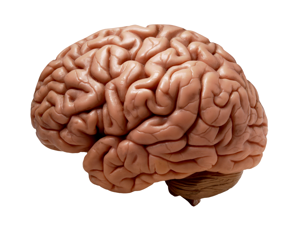
So why is this relevant?
Whenever we communicate our business to others, whether it be through conversation, an elevator pitch, a presentation, a commercial, or even a website, we have the tendency to talk from the neocortex. The problem is, our message isn't being received in the audience's neocortex. It's received in the old brain. The old brain acts as a gatekeeper and rejects anything that isn't relevant to survival. So how do you get past the gatekeeper? The key is to reach the audience at an emotional level first. Your message must be exciting, unique -- intriguing. That was the driving force behind the website design. We wanted a unique design that builds intrigue while being non-threatening. All the important information such as Areas of Practice and Contact Info are visible from the get-go.
Be unique. Be you. A little touch of personality will get you noticed.
Modals
Due to limited screen real-estate, we employed Bootstrap modals to help add supplementary information.
(modals are those cool pop-up things.)
"The problem we foresaw was, how does the user know which items will launch a modal and which are just images? The solution was to add animations on mouseover. The business cards float up and the iPhone vibrates. The animations add a fun level of interaction. Then we grouped the modal objects on the left side almost like a traditional sidebar."
Anand Upadhyay Lead Web Designer at Gumro Media
UI/UX
Our unique website layout called for a creative new take on User Interface and User Experience.
There are only a handful of common website layouts. Web surfers are familiar with the typical design -- navigation bar, header, body, footer. Because we threw out every convention in the book with this layout, we also lost all user familiarity.
To remedy this, we mimicked the sidebar navigation layout. All the links are grouped vertically on the left. It doesn't look like a typical sidebar, but it functions the same way. On a subconscious level, it still feels familiar.
on a screen near you
Creating a new brand identity is a creative challenge. It involves countless little choices that result in something greater than the sum of its parts. We hope this case study was informative and that it provided a glimpse into our design process. If you want to hire us for your own project, or simply say "Hi," you can send us an email at:
info@gumromedia.com
Check out the RLF site: